Seasonal Produce Website


Seasonal Produce is my passion project that I built 0 → 1.
It began as a way for me to combine my love for eating seasonal fruits and vegetables with practicing HTML and CSS concepts with my digital drawing hobby, but as I kept designing and learning it grew to a useful tool that has 3000+ impressions of the home page.
This project involved the intentional use of AI to generate around 80% of the code, 80% of the copy, and suggest ideas for UI and UX design. The website is coded with HTML, CSS, and Javascript. All image assets were illustrated by me in Procreate.
I hope you enjoy reading about it as much as I enjoyed creating it.
Website link:


Role
Full Stack Product Designer, Front-End Developer, Illustrator
Timeline
4+ months
Team
Solo Project
Tools
Figma, Github, VS Code, ChatGPT and Claude, Procreate, Google Analytics 4

"What's in season?"
This is a question that I hear often from friends who want to eat seasonally because they know that seasonal produce is tastier and healthier, but they don’t actually know what’s fruits and vegetables are in season.
Problem Statement
How do I design a simple way for my friends to see which fruits and vegetables are in season today and feel inspired to eat seasonally?

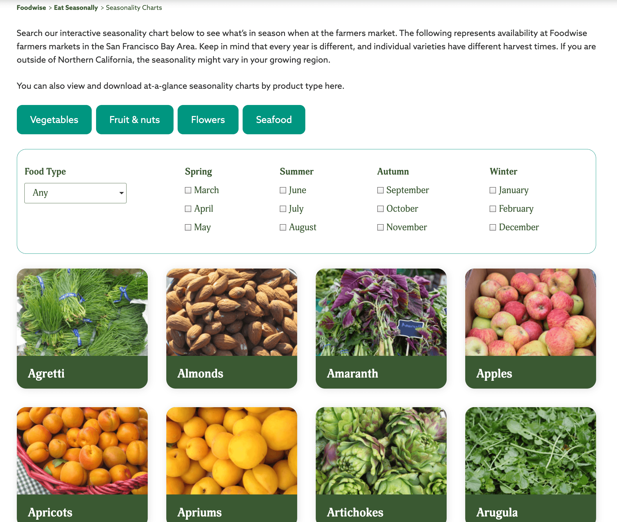
Seasonal Produce is a guide to all the items that are in season today.
The home page lists all items that are in season based on today’s date. Filter items by fruits, vegetables, nuts, or year-round.

Click on an item to learn more about its nutritional benefits and recipe suggestions.

Select a different time period to see what's in season then.

Looking for your favorite fruit or veggie? Find it on the All Items page.


Friends think that Seasonal Produce is useful, and I have data to back that up.
• 3,200 impressions of the home page
• 16% 7-day user retention
• 2 min 30 second average engagement time per active user


The discovery phase began with studying existing websites and asking my friends what they would like to see in a seasonality website.
Competitive Analysis helped me understand what tools are currently out there.

I pitched my idea to users and asked what they would like to see in a produce website.

Armed with insights, I mapped out what the website's structure should look like. I then moved on to creating wireframes to think through the visual composition of each page.
Sitemap

Lo-fi wireframes

I then put together a the first version of the website. You can visit that version here.
Between this first version of the website and the version I used to do user testing I made quite a few additions, including the nav bar, About page, Mission page, and external links to farmers markets in the footer.
I used AI tools for various tasks such as creating lo-fi prototypes, vibe coding, and writing copy.
I used both Claude and ChatGPT to help me build this website. It truly amazes me how much I was able to do with these tools and how much I was able to learn.
Claude helped generate artifacts, which act as responsive lo-fi prototypes. These artifacts helped me visualize how I wanted my nav bar to look and behave.
Nav bar lofi prototypes generated by Claude

I used Claude to help me write a lot of the code that control the features of the website. For example, Claude helped me implement the empty state, which shows an image and text when no items match the selected filters.
Claude's wrote code to implement an empty state that displays text. I modified the code to display an image and text.

Empty state for classification filters

I asked ChatGPT to help me understand my website's undesirable behaviors. It provided technical explanations of these behaviors and offered suggestions for user experience improvements.
Asking ChatGPT why there's a distortion when I close the mobile nav

Implemented its suggestion - page navigation delayed until after mobile nav transition ends

I asked Claude to help me generate the copy in the website. Since I have over 50 fruits, vegetables, and nuts, having it write the nutritional benefits saved me countless hours of time.
Using Claude to write copy

Avocado details page with copy written by Claude


Feedback from user testing guided me to design and implement a few changes that elevated the feel of the user experience.
I showed both the web and mobile versions to 7 users who had no prior exposure to this website. Here are some of the changes I made that address their most salient challenges and concerns.
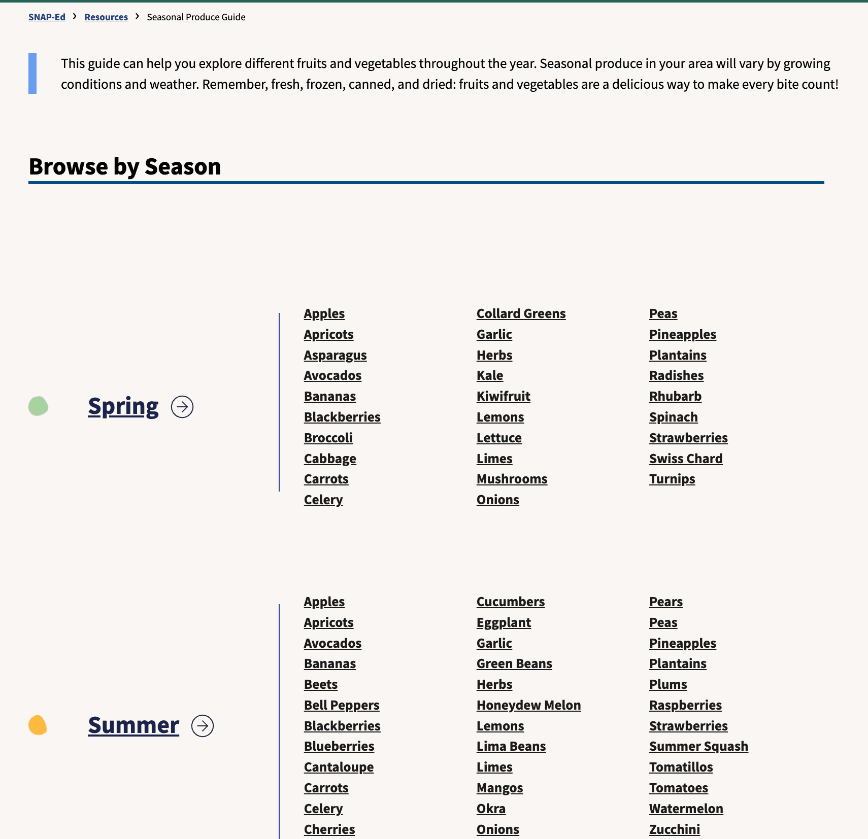
Change #1: I added an All Items page so that users can search for a particular item.
All Items page web and mobile views

“Do you have corn?”
“What about strawberry?”
Users wanted to know if their favorite fruits or vegetables were on this website. To allow users to search for their favorite fruits or vegetables, I added an All Items page, where all items that appear on this website are listed in alphabetical order.
Change #2: I added location cues by adding active state indicators and changing the subtitles to be the page titles.
Mobile nav bar with no active states

Header where subtitle shows today's date

Mobile nav bar with active state highlighted

Header where subtitle shows the page title

“Wait, all of these are in season right now?” A user asked as he viewed the All Items page on his mobile device.
"What page are you on?" I asked, trying to nudge him to realize that he's on the All Items page.
"I'm not sure…"
In order to better guide users through the user flow, I implemented an active state indicator on the mobile nav menu and changed the subtitles to display the page titles. These changes will allow users to see which page they are on.
Change #3: I implemented classification filters to present similar items together and reduce the number of items on the screen.
Home page with no classification filters

Home page with classification filters

"Really cute website! But I don't really want to keep scrolling."
I noticed that users tended to scroll down approximately 3 rows before losing interest and exploring a different page or time period. To address this issue I added filters so that users can view fruits, vegetables, nuts, or year-round produce. These filters reduce the number of items that appear on the screen, reducing cognitive overload.

The design system was inspired by farmers market fruit stands as well as the four seasons of the year.
I wanted my website to feel simple and cute, to provide users a delightfully fun yet educational experience. I believe that my design choices help Seasonal Produce achieve its mission of inspiring users to eat more seasonal fruits and veggies.
The website's UI was inspired by many things. The reoccurring scallop motif and the serif font were influenced by the look and feel of fruit stands in farmer's markets. The colorfulness of the illustrations and the color palettes were inspired by the naturally bold and bright colors of deliciously ripe fruits and veggies.
Mood board

I chose not to have not 1, but 4 color palettes for this website, one for each season of the year. Just as how the 4 seasons of the year feel different, I wanted the experience of visiting this website to feel different when users browse a different season in the dropdown or visit the website during a different time of the year.
For each season there is a color palette consisting of a primary, background, and accent color. I chose colors that I felt best represent the seasons, while still adhering to WCAG standards. All 4 color palettes look harmonious next to each other.
Spring

Summer

Fall

Winter

Style Guide

This project gave me a profound appreciation for all the work that go into launching a product.
Although I spent the bulk of my time being the product designer, illustrator, and front-end developer, I also did the marketing and the post-launch analytics. Whenever I considered adding a new feature, I would be the one implementing it. It was so much fun! But also so much work.
If I had more time and resources:
I would build this website in React.
Component-based architecture would make designing building the website more intuitive, especially as I add more pages and features.
Having a virtual DOM would lead to a better user experience. The website would smoothly transition between pages instead of showing a brief flash of a white screen, which is a limitation of regular Javascript that I tolerated.
The top user feedback that I did not implement was a search feature. I would implement this feature if I had the time and resources.
With search, users can quickly find their favorite fruit or vegetable.
It would be interesting to collect data on the top user searches to inform the expansion of the website.